How to use Buttons and Form Controls
Use buttons and form controls to represent actions, collect user input, and create realistic interface designs.
Before you start
- Make sure you have permission to edit the board and are in design editing mode.
- You can access buttons and form controls from the Elements tab in the Wireframe Library.
Available buttons and form controls
Visily provides a range of buttons and form controls for representing actions, collecting input, and showing different selection states in your interface.
- Buttons. Use buttons to represent actions that users can take in an interface.
- Button: Displays an action using a text label and an optional icon.
- Icon Button: Displays an action using an icon without a text label.
- Button Group: Combines multiple related buttons into one control.
- Input fields. Use input fields to collect text, search terms, selections, and longer responses.
- Textbox: Collects a single line of text.
- Search Box: Lets users enter a search term.
- Dropdown Button: Opens a list of available options.
- Textarea: Collects longer, multi-line text.
- Selection controls. Use selection controls to let users choose options or change settings.
- Checkbox: Lets users select one or more independent options.
- Radio Button: Lets users select one option from a group.
- Switch: Turns an option or setting on or off.
- Slider: Lets users select a value by moving a control along a track.
Add a button or form control
- Open the board where you want to add the element.
- Open the Wireframe Library.
- Select the button or form control you want to use from the Smart Components section.
- Click the canvas to add it.
- Move, resize, or customize the element as needed.

You can also press B to quickly add a Button element.
Manage a Button element
Select a Button, Icon Button, or Button Group to open its toolbar. Depending on the selected element, you can:
- Style: Choose a preset style to quickly update the button’s appearance.
- State: Change the button state, such as default, hover, pressed, or disabled, to represent different interactions.
- Size: Select a preset size or manually adjust the text size, width, height, and padding.
- Add icon: Add an icon before or after the button label. For an Icon Button, choose the icon displayed inside the button.
- Edit style: Customize the button color, layer opacity, blur, corner radius, and shadow.
- Text style and alignment: Format the button label and control how the text and icon are aligned within the button.
- Divider: Customize the dividers between buttons in a Button Group.
- Equalize button width: Make all buttons in a Button Group the same width for a consistent layout.
- Save as template: Save the button and its settings as a reusable template.
- Export: Export the selected button elements to image/PDF or to Figma.
- More actions: Access additional options such as align, arrange layers, copy, paste, duplicate, and delete.
Manage an input field
Select an input field to open its toolbar. Depending on the selected element, you can:
- Style: Choose a preset style to quickly update the field’s appearance.
- State: Change the field state, such as default, focused, filled, error, or disabled, to represent different interactions.
- Size: Select a preset size or adjust the field dimensions and spacing.
- Add icon: Add an icon to the input field to provide context or represent an action.
- Edit style: Customize the field color, layer opacity, blur, border style, corner radius, and shadow.
- Add label: Add a label to describe the information users should enter or select.
- Placeholder: Show or hide the placeholder text displayed inside the field.
- Text style and alignment: Format the text and control its alignment within the field.
- Save as template: Save the input field and its settings as a reusable template.
- Export: Export the selected elements to image/PDF or to Figma.
- More actions: Access additional options such as align, arrange layers, copy, paste, duplicate, and delete.
Manage a selection control
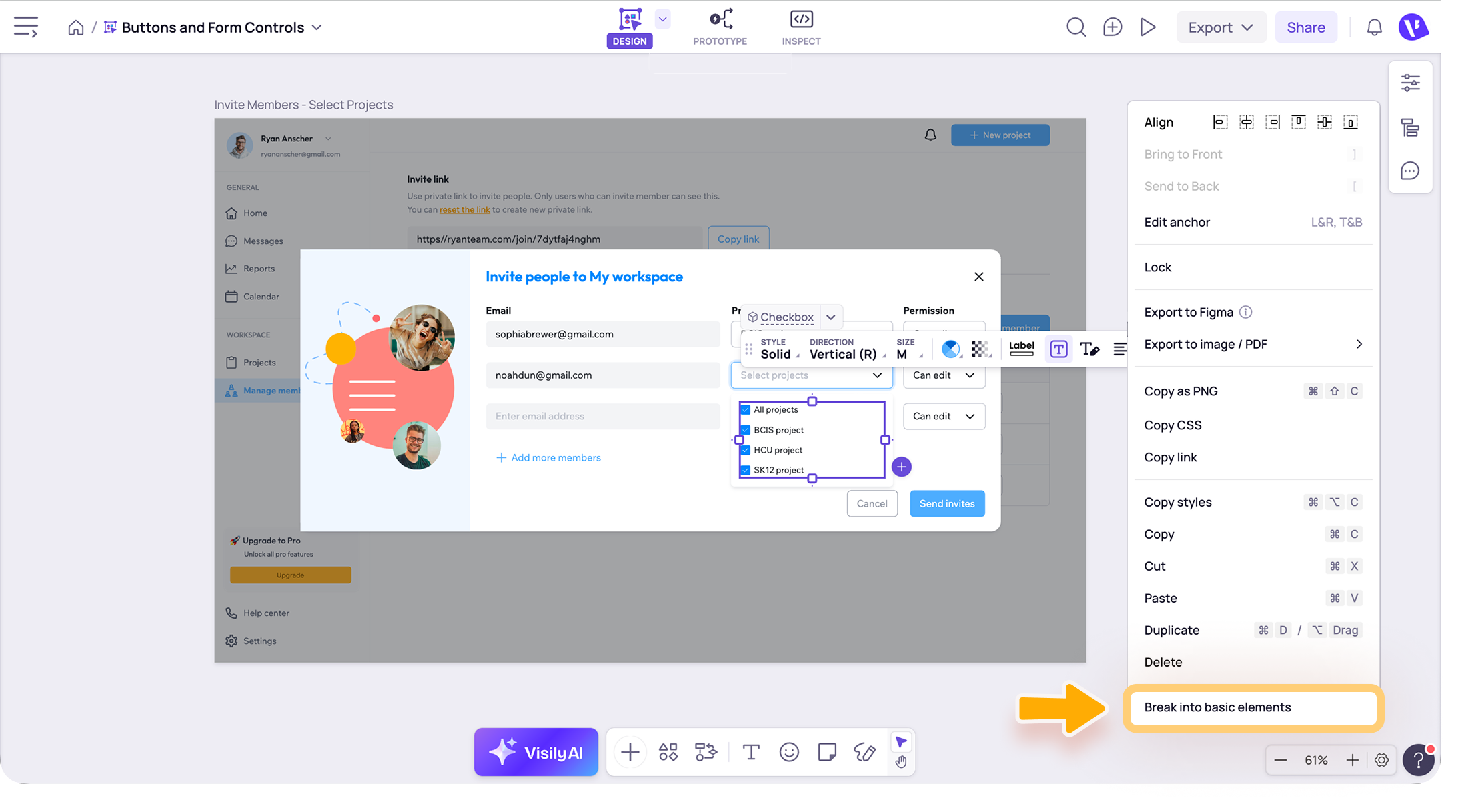
Select a Checkbox, Radio Button, Switch, or Slider to open its toolbar. Depending on the selected element, you can:
- Style: Choose a preset style to quickly update the control’s appearance.
- Direction: Arrange the control and its label horizontally or vertically.
- State: Change the control state, such as selected, unselected, on, off, or disabled.
- Size: Select a preset size or adjust the control dimensions.
- Edit style: Customize the color, layer opacity, and shadow.
- Add label: Add a label to describe the option or setting.
- Text: Add, remove, or edit the text displayed with the control.
- Text style: Format the label text, including its font, size, and emphasis.
- Text alignment: Control how the text is aligned with the selection control.
- Handle border: Customize the border around the control handle.
- Track corner radius: Adjust the corner radius of the control track.
- Tick marks: Show, hide, or customize tick marks where supported.
- Save as template: Save the selection control and its settings as a reusable template.
- Export: Export the selected elements to image/PDF or to Figma.
- More actions: Access additional options such as align, arrange layers, copy, paste, duplicate, and delete.

If you want to edit or reuse each part of the smart components separately, select Break into basic elements.
Note
- Buttons and form controls help make your design look realistic, but they do not automatically perform actions. To make an element interactive, switch to Prototype mode and add an interaction, such as navigating to another screen or opening an overlay.
- For a Slider, drag the handle along the track to adjust the displayed value or position.
- To add another option to a Checkbox or Radio Button group, select the element and click the + icon that appears next to it.
Need more help?
If this does not solve your issue, contact support and include a screenshot if possible.