How to use Menus and Navigation Components
Use menu and navigation components to organize links and help users move between screens, pages, or sections of an interface.
Before you start
- Make sure you have permission to edit the board and are in design editing mode.
- You can access menu components from the Smart Components section in the Wireframe Library.
Available menu components
Visily provides several menu components for different navigation layouts:
- Header Menu: Creates a horizontal navigation menu, typically placed at the top of a screen.
- Tab Bar Menu: Organizes navigation items into tabs that users can switch between.
- Sidebar Menu: Creates a vertical navigation menu for the side of a screen.
- Collapsed Sidebar Menu: Creates a compact sidebar that primarily uses icons and optional text.
Add a menu component
- Open the board where you want to add a menu.
- Open Wireframe Library.
- Select the menu you want to use from the Smart Components section.
- Click the canvas to add it.
- Move, resize, or customize the menu as needed.

Menu components help represent navigation in your design, but they do not automatically navigate between screens. Add interactions in Prototype mode to make them functional.
Manage a menu component
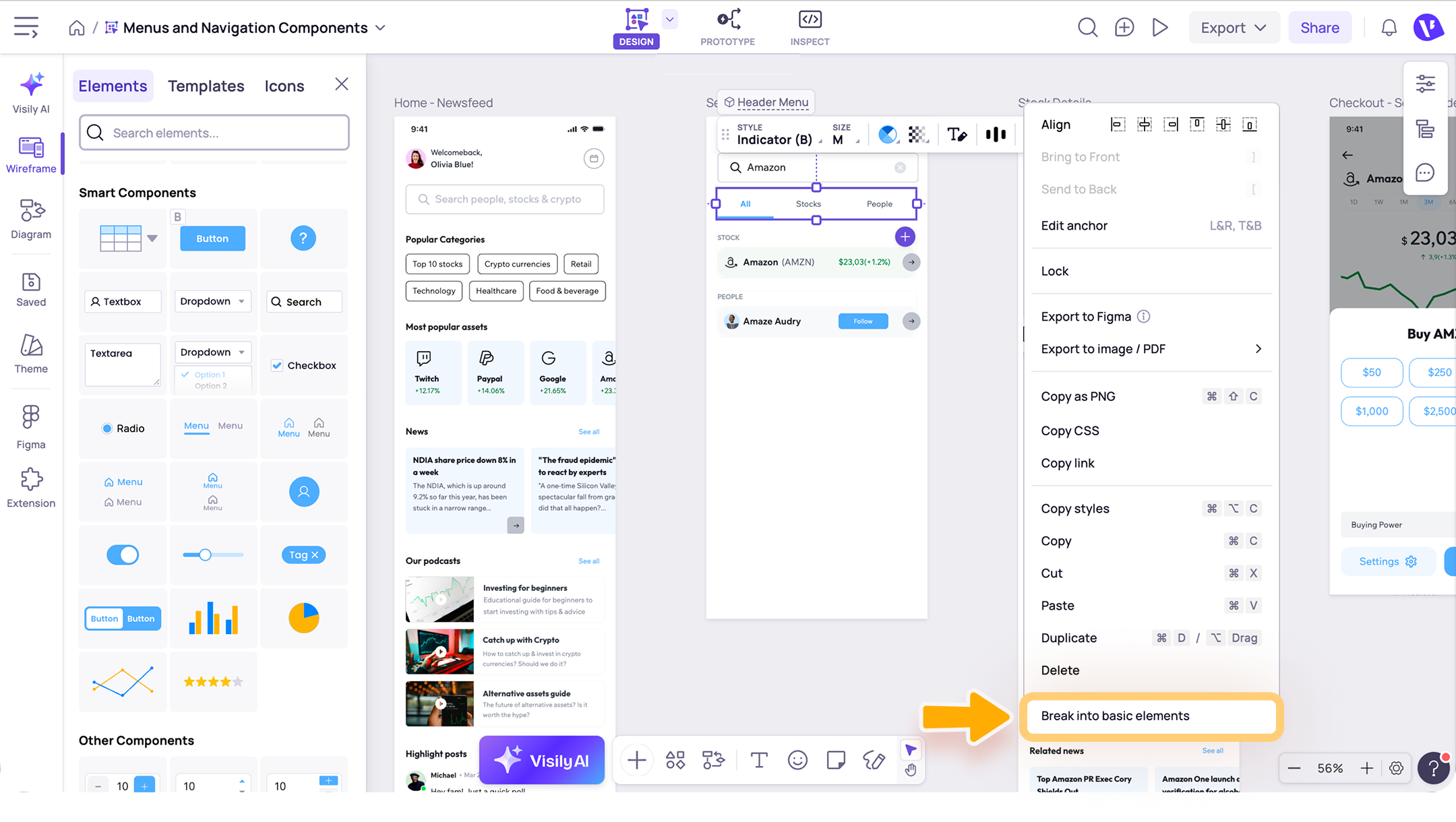
Select a menu component to open its toolbar. Depending on the selected element, you can:
- Style: Choose a preset style to quickly update the menu’s appearance.
- Size: Apply a preset size or manually adjust the menu dimensions, spacing between items, and padding.
- Color and opacity: Customize the menu color and layer opacity.
- Text style and alignment: Format the menu text and control how it is aligned within each item.
- Equalize menu item width: Make all items in a Header Menu the same width for a consistent layout.
- Add or remove text: Show or hide text labels in a Tab Bar Menu or Collapsed Sidebar Menu.
- Save as template: Save the menu and its settings as a reusable template.
- Export: Export the selected menu component to image/PDF or to Figma.
- More actions: Access additional options such as align, arrange layers, copy, paste, duplicate, and delete.

If you want to edit or reuse each part of the smart components separately, select Break into basic elements.
Need more help?
If this does not solve your issue, contact support and include a screenshot if possible.